

To make a solid layout for the whole text in the document, we will wrap them in one box, which is called 'div' (a sort of tags in HTML).
〈div〉
〈h1〉...your contents〈/h1〉
〈h2〉...your contents〈/h2〉
〈p〉...your contents〈/p〉
〈/div〉
What is div? user AkashRawat in a community geeksforgeeks explains that the div tag is known as Division tag. The div tag is used in HTML to make divisions of content in the web page like (text, images, header, footer, navigation bar, etc). Div tag has both open(〈div〉) and closing (〈/div〉) tag and it is mandatory to close the tag. The Div is the most usable tag in web development because it helps us to separate out data in the web page and we can create a particular section for particular data or function in the web pages.
And now, I will make a class to this div box, writing class = "container" next to the word div, because I will make more div(s) for the document and I want to differentiate each div, making a special name on each wrapper box. You can name your class as you want.
Then I will set some CSS properties to the container div.
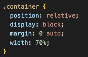
What I did here is clarifying position and display, and setting the width of the box and margin.
I found a nice documentation written in Freecodecamp.org. According to her article, position is literally a propoert controlling how elements behave and are positioned on the page. I will quote parts of the documentation from now on.
For example, you may want to stack elements next to each other or on top of one another in a specific way, and so on. To do the above, and much more, you'll use CSS's position property. This property takes in five values: static, relative, absolute, fixed, and sticky. Default is static.
With the default position:static, all elements will be visually rendered, following the order of the HTML code. Tags like div, p, h1, h2..(headers) are block elements, meaning it takes the whole block of a line. However, this default static positioning doesn't leave any room for flexibility or to move elements around. (2021, Lemonaki) What if you wanted to move the a div or a p element a bit towards the left of the page – how would you do that? Normally you will use four basic offset properties, like top, bottom, right and left. Unfortunately, however, if you try to apply them to the element having the static position, these properties will do nothing.
That is why it's likely that you'll use position:realtive more often! You see I set the position as relative in the CSS cide image above, right?
How does the position:realtive work then?
position: relative works the same
way as position: static;, but it lets you change an element's
position. But just writing this CSS rule alone will not change
anything. To modify the position, you'll need to apply the
top, bottom, right, and left properties mentioned
earlier and in that way specify where and how much you want to move
the element. The top, bottom, right, and left offsets push the tag
away from where it's specified, working in reverse. top in fact moves
the element towards the bottom of the element's parent container.
bottom pushes the element towards the top of the element's parent
container, and so on.
(2021, Lemonaki)
From this description, you could read why I used the relative positioning to the container div box. Yes, I wanted to move them as I wanted. For example, let's say that I want to move the div a bit right side and a bit downward from the top.
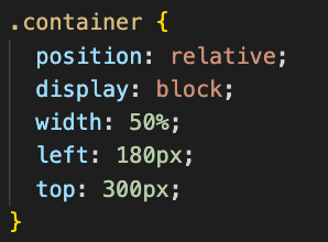
Writing this will make a result
like:

(* If you use % unit for the 'top' attribute in the div, it's likely not
working. That's because the top of the its container is currently the
height of the, but it hasn't have a specified height
value. If you apply the height to the div, the percentage will work.
Using the % unit to the left and right will be working well in most of
cases.)
Please don't really be bothered by the display: block here,
because it is just a default setting, so not writing it doesn't influence to this div at the moment.
Let me also quickly explain position: fixed and position: sticky
Let's read how the MDN documentation define them.
From its description, some of you might not totally get the differences between the fixed and sticky.
A tech community Stackoverflow, a user BoldClock explained the differences very well. position: fixed always fixates an element to some position within its scrolling container or the viewport. No matter how you scroll its container, it will remain in the exact same position and not affect the flow of other elements within the container. Without going into specific details, position: sticky basically acts like position: relative until an element is scrolled beyond a specific offset, in which case it turns into position: fixed, causing the element to "stick" to its position instead of being scrolled out of view. It eventually gets unstuck as it gets scrolled back toward its original position. At least, that's how I understand it in theory.
To explain the use of display:block in the CSS, like I mentioned above, it honestly doesn't really make any change here because div element is set as block in default. By now some of you might wonder why I did clarify it though. According to MDN again, what display:block does is generating the element as a block element box, with line breaks both before and after the element when in the normal flow.
The reason why I clarified the display:block in the div is that I wanted to make the container div box horizontally centered :)
One of the common practices to align a div horizontally centered is to use margin: 0 auto in your div CSS.
*It works when the div has position: relative. It won't work if the div is set as position: absolute.
Let me change the CSS setting like below:
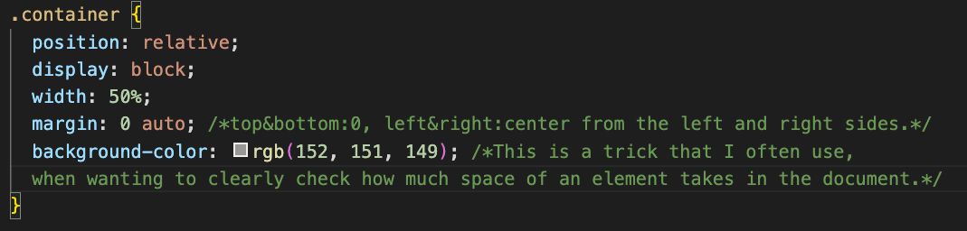
I set a background-color, which is the trick that I often use to clearly see the space of the div takes. By the way, you can use both background: rgb(_,_,_) and background-color:background: rgb(_,_,_)
Then it will look like:

Isn't it nice that it is center-aligned as intended? The first parameter, which is 0, ofmargin: 0 auto is top & bottom attributes, and the second one refers left & right. Where auto means that the left and right margin are automatically set by the browser based on the container, to make element centered. sides. It guarantees that the left and right margins will be set to the same size. The first parameter 0 indicates that the top and bottom margins will both be set to 0. By the way, the margin and padding originally can have four paremeters. In order, they are top, right, bottom, left. (e.g. margin: 2px 8px 2px 6px) Thus, margin: 0 auto is the same with margin-top: 0;margin-bottom: 0; margin-left: auto; margin-right: auto;
And the reason why I had to clarify the display:block in the div was to make sure margin:0 auto to be functionable. This is because with display:inline-block and display:inline, the margin: 0 auto won't work! I just wanted to clearly show inform you that it works with when an element's display is set as block.
There are also other CSS properties that don't match
margin: 0 auto, with the intention
to align an element center. Setting
position: absolute; won't also work
with the margin: 0 auto. Here I must
quote a part of a
documentation
that I studied. There is another condition for the
margin: 0 auto trick to be
functionable, which is specifying the width of the element. That is why
I set the width: 50% in the
container div.
(from:
https://stackoverflow.com/questions/3170772/what-does-auto-do-in-margin-0-auto_)
Margins make little sense on absolutely positioned elements since
such elements are removed from the normal flow, thus they cannot push
away any other elements on the page. Using margins like this can only
affect the placement of the element to which the margin is applied,
not any other element.”
(PFEIFFERTHEFACE.COM, 2022, Author unknown)
Ah, by the way you can also make an element that is placed inside of a div horizontally centered.
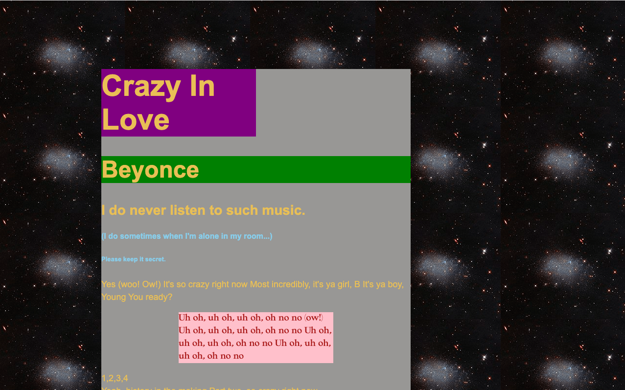
In the example of the beyonce file, I will remove the margin:0 auto from the container div. It will be just normal relative box. It's moved left-ward and bottom-ward, as I set left: 200px; and p: 100px;. Here, if I want to make the paragraphs that have class 'oh' horizontally centered, I can set the margin: 0 auto to the .oh in the CSS file.

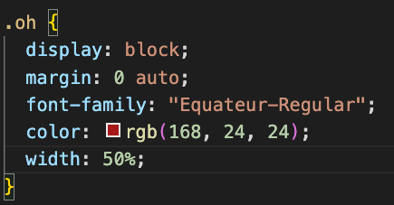
Then only the paragraphs with 'oh' class will be center-aligned.
Ah yea, and do you remember that I told you the div, p, headers (h1, h2, and so on) are in default display: block? But then, the thing about this block elements is that it takes the whole available width of a document, starting in a new line. Meaning, it's a bit hard to control the location of it unless you put more layers of CSS attributes.
My apology if my explanation is trippy. Here I would like to talk about display: inline-block and display: inline. With inline, the element stays in the same line and only takes up the width of its content. The thing is, there are disadvantages of the inline display; 1)You can't control the height and width properties of inline elements. 2)The display: inline disregards the padding and margin settings. For these reasons, in practice display: inline-block is used more than display: inline, in terms that with the inline-block the element is displayed as an inline element but can be styled as a block level element, as well as controllable the width, height, padding and margin. I studied the knowledge from Bitdegree
You could check it from the beyonce2.html and beyonce2.css files. The last paragraph has an ID called uniquefont. And if you see the CSS file, there is the display: inline-block set on the element. Now, you could maybe try to add some padding-left 20%. Once you re-save the file and open the HTML, you'll able to see the padding-left is applied :)
By the way, I haven't talked about position: absolute.
According to
MDN documentation, an element with the absolute positioning is removed from the normal
document flow, and no space is created for the element in the page
layout. It is positioned relative to its closest positioned ancestor, if
any; otherwise, it is placed relative to the initial containing block.
Its final position is determined by the values of top, right, bottom,
and left.
(from: https://developer.mozilla.org/en-US/docs/Web/CSS/position)
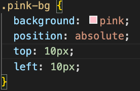
So, for example, if you would like to move a paragraph that has clasees 'oh' and 'pink-bg' from the beyonce2 file, as you want, not upon the flow of the document you can set it's position as absolute.
Then it will look like this:
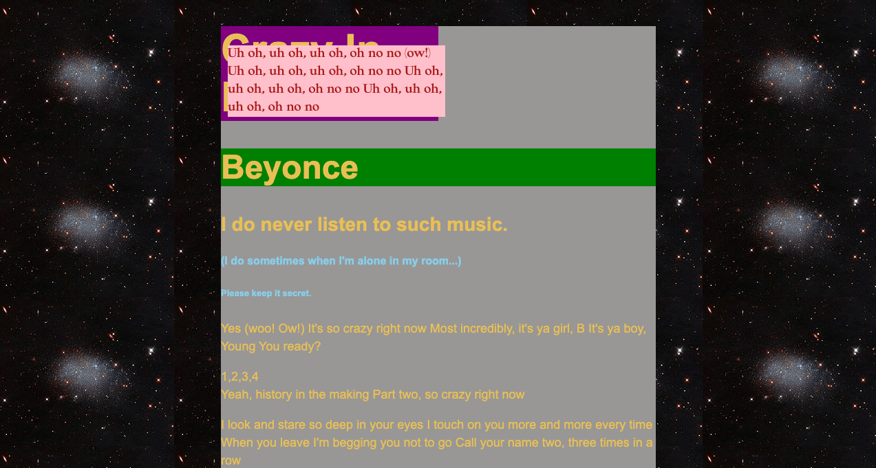
As this example illustrates, if an element has the absolute positioning, it disregard the document's normal flow and it is set upon its nearest parent, which is the container div box. So, from the div, it has top:10px and left:10px attributes.
I would like to let you know there is one of common practices to make an element be center aligned in both horizontal and vertical direction, with the position: absolute.
Let's imagine that you have quite a short content in a HTML document, so that they are not vertically overflown. Some of you might wonder if you can place it to the center of the page.
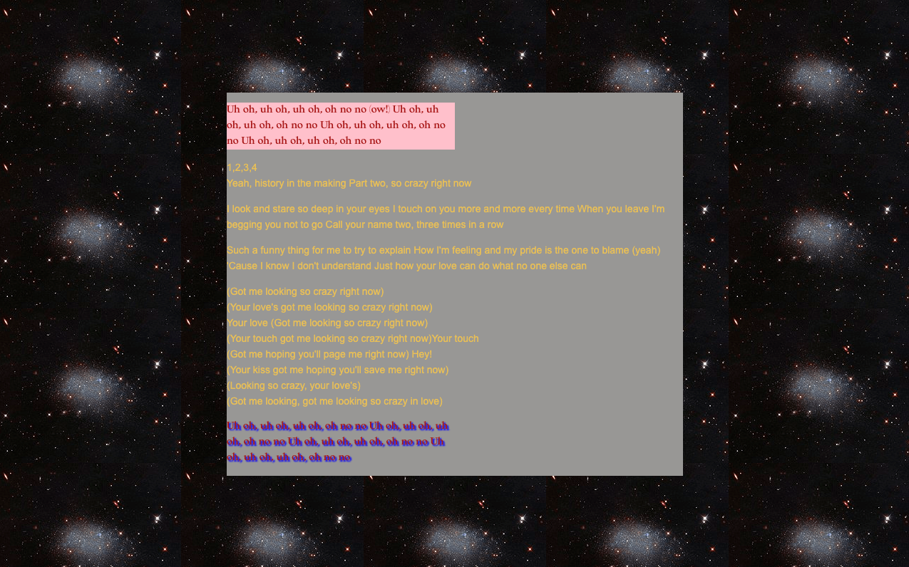
Using position: absolute with top: 50% , left: 50% ,then transform: translate (-50%, -50%) make it possible.
I can write like this:
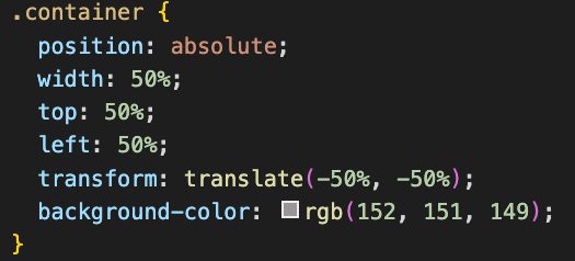
Then it will be rendered like this:
By now you would be curious what the transform: translate (-50%, -50%) is. I will quote MDN documentation here.
The transform CSS property lets you rotate, scale, skew, or translate
an element. It modifies the coordinate space of the CSS visual
formatting model.
(from:https://developer.mozilla.org/en-US/docs/Web/CSS/transform)
According to Abhilasha Chougule from EDUCBA, the CSS translate() is a function used for aligning the elements in different directions (horizontally and vertically or up and down). This function can have 3 axes namely x, y, z which they can be declared independently or two-axis with 2D or 3 axes with 3D translate. To study in detail, you could have a look the article.
What the transform: translate(-50%, -50%) does is lining up the center of the element to with the center of its parent, in this case which is body. In simple terms, it can be boiled down to translateX(-50%) translateY(-50%), which means:
This effectively moves the center of the element to its original top left corner. When you set left: 50%; top 50% on the element, you are moving its top left corner to the center of its parent (which means it is not visually centered at all). By moving the element back leftwards and upwards by half of its width and height respectively, you sure that its center now aligns with the parent's center, making it visually horizontally + vertically centered.